2017 Colour Forecast
Sentience
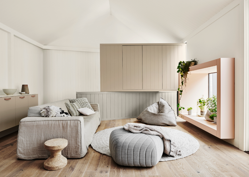
Tactility is our relief from the pressure of the screen and the smooth unsympathetic surfaces we endure daily. Colours featured: Dulux Calm Peak, Dulux Mt Albert, Dulux Pūpū Springs and Dulux Tītahi Bay.
Texture has become a remedy for our senses
Move away from smooth, cold surfaces and surround yourself with warm colours, flesh tones and vegetal hues. Rediscover colours that are soothing and restorative; relaxing and tonal, but not dull. Create interiors with texture, tactility and undulating surfaces.
Subtle pastels and soft naturals make up the Sentience palette. New beiges with a hint of grey are versatile and will pair easily with the mellow hues of the range.
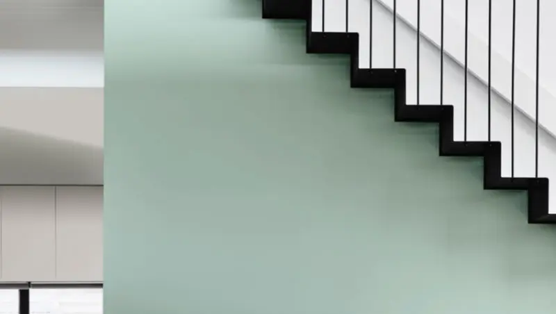
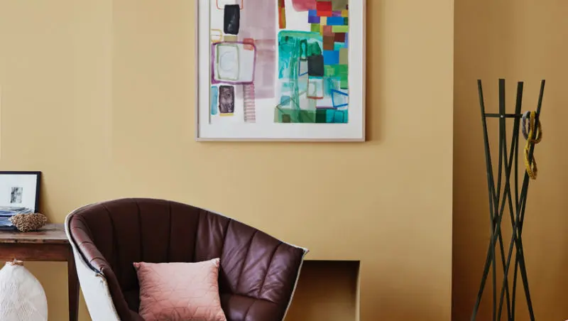
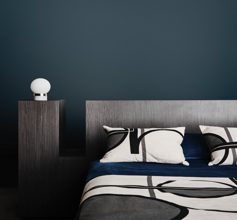
Sentience Gallery
Colour palette
Colours displayed should be used as a guide for your colour selection. To ensure best accuracy, test your colour choice at home by ordering Dulux Sample Pots and Large Colour Swatches.
Order sample pots or A4 colour swatchesBring this trend to life in your home
The Sentience trend is almost as much about texture as it is about colour. It features warm hues, flesh tones and vegetal shades that are soothing to the senses and a delight to both run your eyes over and to touch.
How to get the look
Other trends
Disclaimer
Colours displayed should be used as a guide for your colour selection. To ensure best accuracy, test your colour choice at home by ordering Dulux Sample Pots and A4 Colour Swatches.