Dulux Colour Forecast 2015
Connection
Pink and green led the 2015 palette colours. Sophisticated pink hues partnered with gentle pastels were set to dominate interiors. We also saw bright, bold blends to relaxed neutral combinations.
It was a reflection on how continual connectivity through technology reinforced our basic human desire to connect in the real world. Connection with the earth by feeling the soil between our fingers, connection with ourselves by taking time to pause, connection with our heritage by re-learning forgotten skills, connection with our playful side by indulging in colour.
Wildland
The beautiful Wildland palette offered neutrals, inky blues and earthy grey beiges for those seeking a more subtle change to their environment.
Wildland Palette
Driven by our basic need to connect with the environment around us, we surround ourselves with colours that reflect untamed landscapes from the harshest ice terrains to the wildest forests and mountains. Wildland illustrates a story through the contrast of light and dark – virtuous versus malevolent, a story of discovering the beauty in what nature has created and embracing imperfections. Taking comfort in the most primitive of materials such as timber, stone, leather and fur we reconnect with our primal selves.
Silentshift
The Silentshift palette offered a range of delicate pastels in pinks, mauves and blues to change the feel of your space and provide a sedate and tranquil atmosphere.
Silentshift Palette
Our digital demands required us to be forever alert. At the risk of fatigue and overstimulation, we were taking time to pause, unplug and recuperate. Silentshift’s soft colour palette allowed us to create spaces in which there was minimal pattern and contrast, inviting your mind to rest and be silent. We shift our approach to finding a new balance between fast-paced and slow living. Simple curves and block colours in cosmetic hues create ethereal spaces with a dreamlike quality, conducive to silent moments.
Modhaus
The Modhaus palette was perfect for anyone keen to make a statement with its selection of bold oranges and blues with the influence of pop art.
Modhaus Palette
A playful approach to design allowed us to reconnect with a time when there were less restrictions on our creativity. Modhaus took its cues from design movements where form did not necessarily follow function and colour was explored using bold playful combinations. Memphis design of the 1980s was at the core of this trend. Contrasting colour blocks that appeared to be spliced between graphic patterns, often in black and white, played against geometric shapes that repeated to create a sense of order that balanced out the colour play.
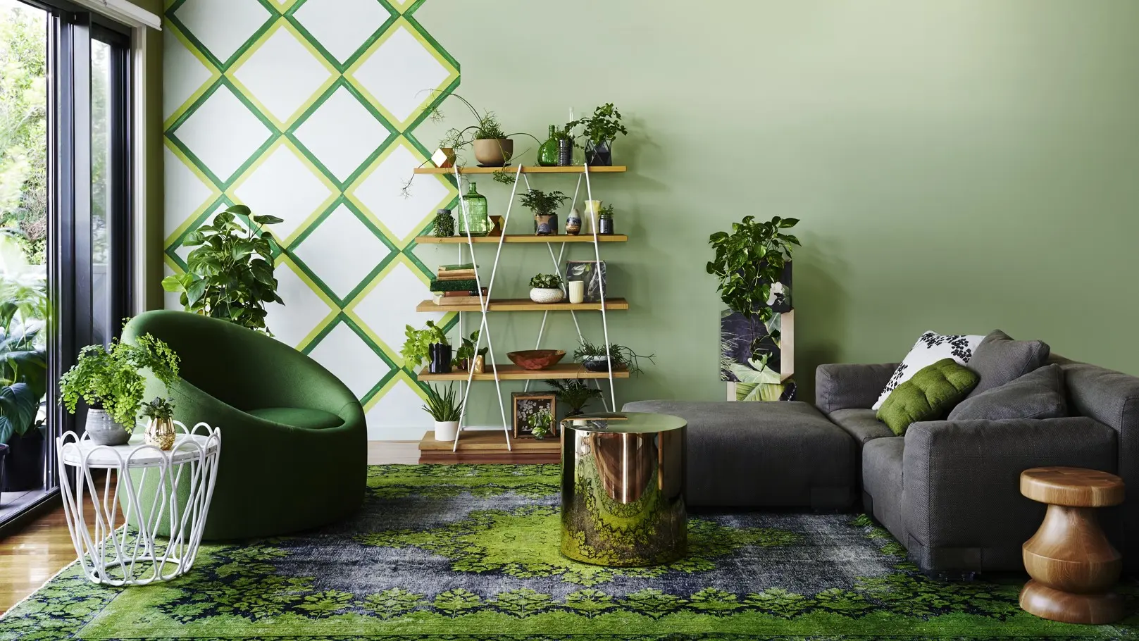
Earthwerks
The Earthwerks palette included a range of greens we are exposed to in surrounding landscapes and flora and fauna.
Earthwerks Palette
Reducing our impact on the earth continued to be a crucial community goal as we aspired to get in touch with nature on a more personal level. Earthwerks explored our desire to have greenery in our homes and workspaces. The urge to get our hands dirty, to create things from scratch and be aware of the provenance of our food drove this trend. A palette drawn from greens and mineral hues created spaces where real nature blended seamlessly with future interiors.
Dulux Colour Forecast: now and then

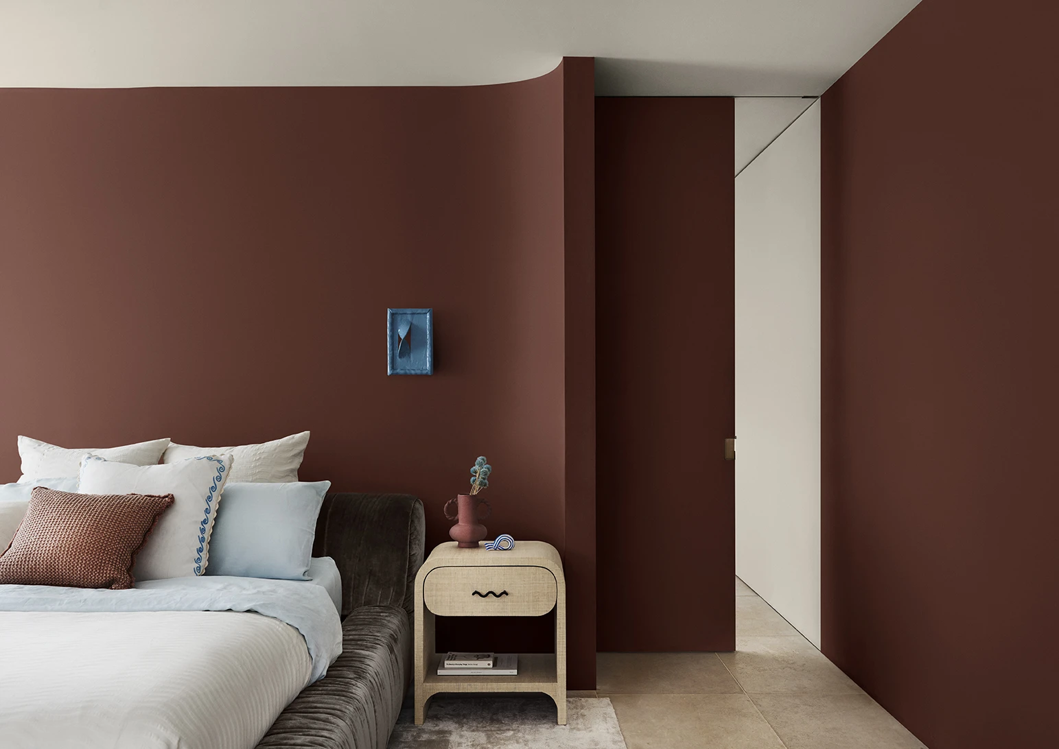
Dulux Colour Forecast 2024 reflects an inner desire for positivity and spaces that nurture within our homes with warm colours such as rich golds, olive greens and reddy browns.
We're proud to be at the forefront of colour trends in interior design as we celebrate the 15th anniversary of the Dulux Colour Forecast!

Download the Dulux Colour Forecast 2024 brochure to explore the three beautiful palettes and be inspired to transform your home with the latest trends.
Love your colour
Dulux Colours of New Zealand
Only Dulux colour mixed with Dulux Wash&Wear® paint gives you exact colour accuracy to create the iconic Dulux Colours of New Zealand colours that look fresh in your home for years.


Disclaimer
Colours displayed should be used as a guide for your colour selection. To ensure best accuracy, test your colour choice at home by ordering Dulux Sample Pots and A4 Colour Swatches.