Dulux Colour Forecast 2013
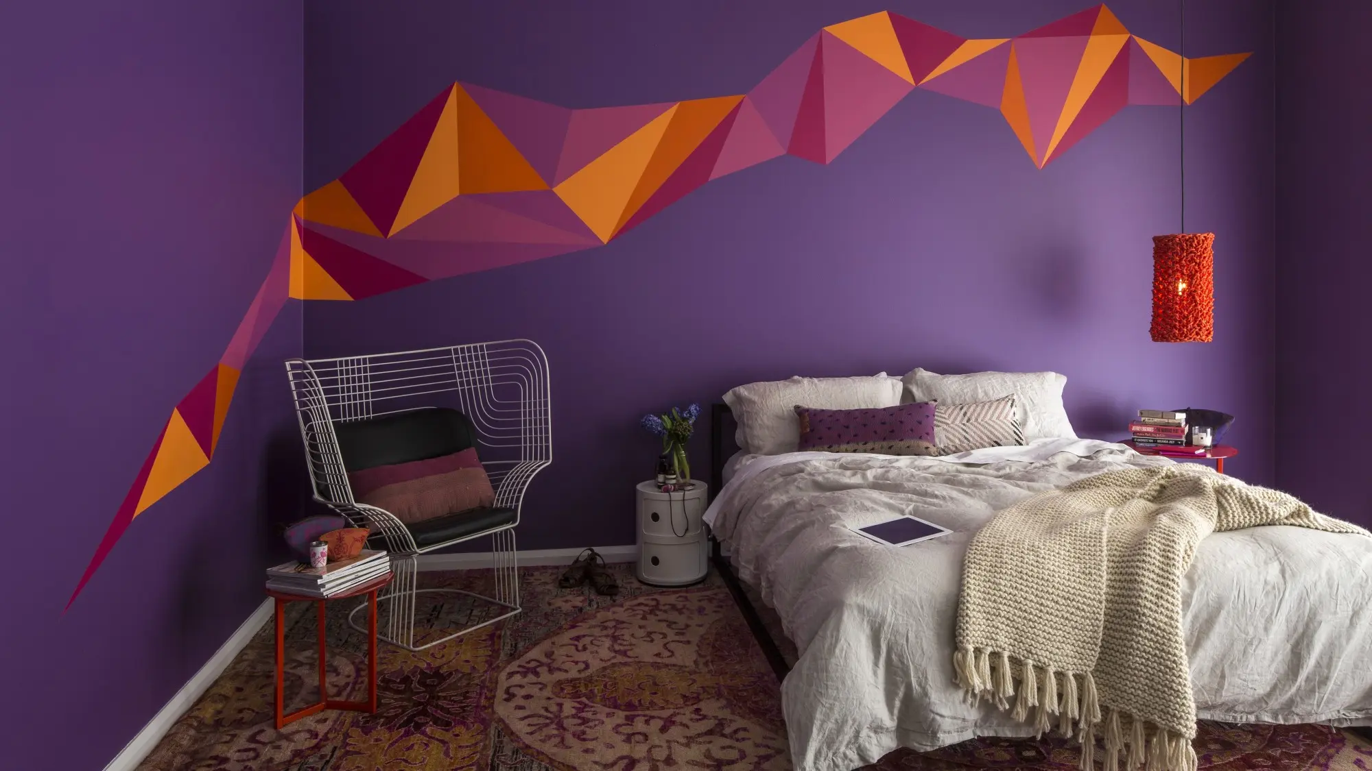
Vintage design, fossicking and gathering, the meeting of old and new, and the rise of new technology were among the key influences that dominated the Dulux Colour Forecast in 2013. Pictured: Blur Palette.
The 2013 Colour Forecast drew on the themes of “movement”; social change, people power and the march of the digital age. It explored how colour was shifting and changing in modern times. Dulux forecasters identified six palettes, each reflecting a major trend in paint colours. Merge was warm and earthy, Seek updated vintage shades, Empower’s blue-greens spoke of confidence, Relaxing Rise used a soothing Japanese-inspired aesthetic, Share was monochromatic with metal and stone influences, and Blur was bold and daring.

Share
The monochromatic palette of Share put forward the idea of a world drawn together, with people sharing and soaking up information daily via social media, stimulated and inspired constantly by technology.
Share palette
Share’s greys and metallics worked with digital patterns, positive and negative space, tonal shadows and texture to create the mood. An interest emerged in natural stone, marble and metals that was reflected in the palette. Natural matt finishes prevailed over minimal use of gloss and lacquer. Colours were inspired by nature and transformed by technology such as Moxa and Steel Shimmer from our Design Effects Metallic range.
Empower palette
Empower reflected globalisation as “people power” was being reinvented through new forms of communication and social media. This palette captured this movement and its spirit.
Empower palette
The Empower Palette, in blues and blue-greens, showed the power of colour en masse. Empower’s range of blues inspired optimism, openness, sincerity, truth and communication. It was an evolution of the blue trend with added freshness and vibrancy with shades such as Green Buoy, Liberty and Mitchell Blue.
Merge
Merge was about blending the old and the new. The palette provided a nostalgic reflection, which was much needed in times of global turbulence.
Merge palette
The Merge Palette was about translating influences from the past, particularly the mid-century era, into something more contemporary. Revived, revamped, and reinterpreted with new technology rather than reproduced. There’s a focus on craftsmanship and down-to-earth simplicity of style – with technology added. Think analogue reconciled with digital. Natural stone colours were highlighted with orange-based reds and pinks. Nostalgia was evoked with a new twist to traditional looks with colours such as Camel Hide, Persimmon or Nile Street.
Blur
Blur reflected the "now, now, now" state of our technologically driven world, particularly in the retail environment.
Blur palette
Blur was daring and bold, and laughed out loud. The hues were warm and vibrant and create excitement as were used together. A palette of pinks through to fuchsia and purple contrasted with oranges and chromatic almost reds such as Gladstone Road, Grand Poobah and Bright Delight.
Seek
The Seek palette drew on the notions of collecting and gathering, fossicking in our past for something precious to re-use and reinvent. Thrift was the new maxim in these times of economic ambivalence. Shoppers were savvy.
Seek palette
Designers and artists found ways of repurposing ordinary materials, as manufacturers re-consider the function of products. Collections of objects possess past histories from different times and places. These objects had either been inherited, salvaged or handmade. Seek’s hues recalled various eras before they became worn and faded. Colours reminiscent of past eras included Gimblett Rd, Green Paw Paw and Morikau.
Rise
The Rise palette, influenced by the Japanese design aesthetic, comes as a retreat from our chaotic world.
Rise palette
The Rise palette's neo-pastel hues suggest a composed environment with space for contemplation. Calm, quiet, considered and above all functional, it’s a design style that fits with today’s need for cocooning. Colours convey serenity and comfort, and offer emotional connection. Though seemingly minimalist, the soft tones are punctuated by brighter gelato hues of green and blue. Soothe the senses with the almost ethereal, sophisticated and functional shades of Winnow, Celery Satin or Dewpoint Quarter.
Dulux Colour Forecast: now and then
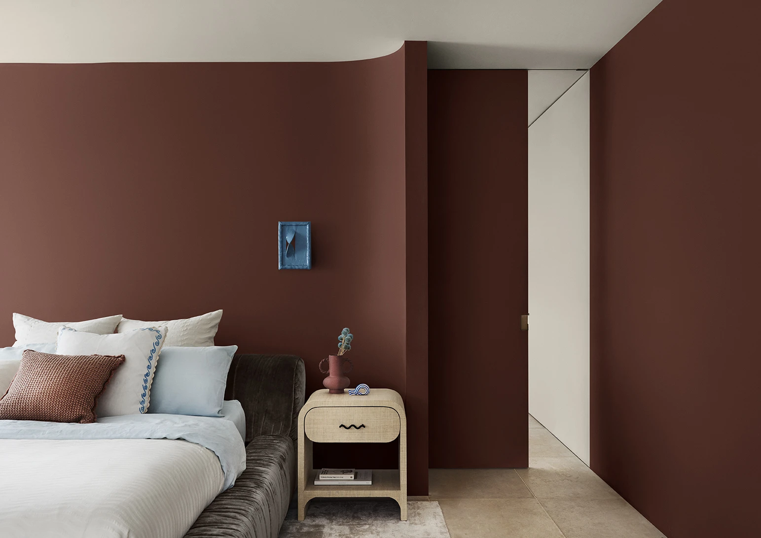
Dulux Colour Forecast 2024 reflects an inner desire for positivity and spaces that nurture within our homes with warm colours such as rich golds, olive greens and reddy browns.
We're proud to be at the forefront of colour trends in interior design as we celebrate the 15th anniversary of the Dulux Colour Forecast!
Download the Dulux Colour Forecast 2024 brochure to explore the three beautiful palettes and be inspired to transform your home with the latest trends.
Love your colour
Dulux Colours of New Zealand
Only Dulux colour mixed with Dulux Wash&Wear® paint gives you exact colour accuracy to create the iconic Dulux Colours of New Zealand colours that look fresh in your home for years.
Disclaimer
Colours displayed should be used as a guide for your colour selection. To ensure best accuracy, test your colour choice at home by ordering Dulux Sample Pots and A4 Colour Swatches.


