Ōhope Beach School
Case study
Specification for Ōhope Beach School was tailored to meet the client’s needs for product and colour performance.
Project Overview
Architect: Ignite Architects
Builder: Marra Construction
Background
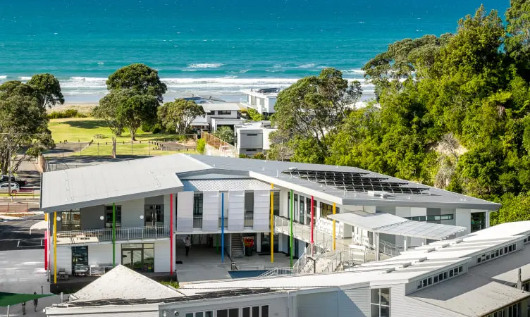
Situated east of Whakatāne and just metres from the rugged eastern coastline of the Bay of Plenty, Ōhope Beach School has a role of more than 300 pupils from Year 0-6 and offers its pupils arguably one of the most inspiring learning environments in New Zealand.
The Challenge
The school is built in an exposed position in the valley with prevailing winds and sea spray from the coast, meaning the new building needed coastal weather durability.
With high usage by a couple of hundred primary-aged students, cleanliness and hygiene is another factor that needed to be considered.
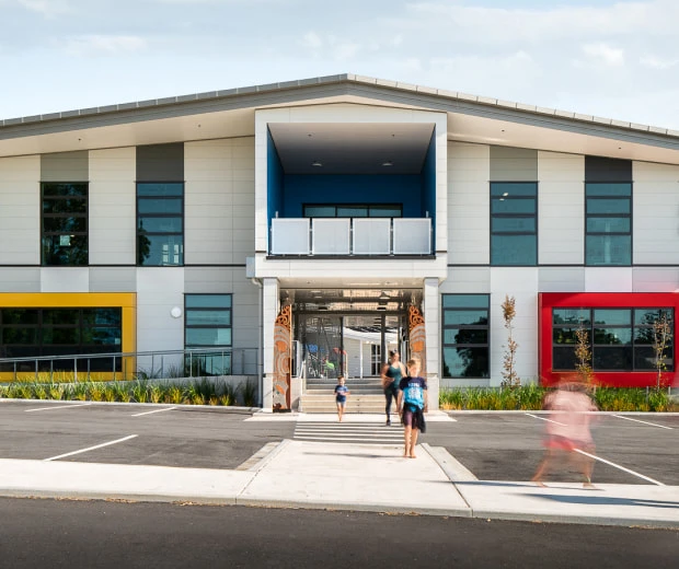
Prior to Ōhope Beach School’s redevelopment, the school lacked both colour and presence to the street. It was important to both brighten up the school and represent cultural identity.
The Solution
The exterior masonry of the school was painted with Elastomeric 201. This was chosen for its highly flexible, extremely weather resistant properties, and Weathershield for the other cladding and soffits. The school is built in an exposed position in the valley with prevailing winds and sea spray from the coast. The windows, aluminium joinery, entry gate and stair screen were all powder coated. The Dulux Duratec® range was chosen for this due to its high-performance colour retention and gloss specifications and ensures a durable and easy to maintain building.
The school interior was painted in Wash & Wear Kitchen & Bathroom for its stain resistance, washability and anti-bacterial properties, all the walls were brush and rolled and the doors and trim spray finished.
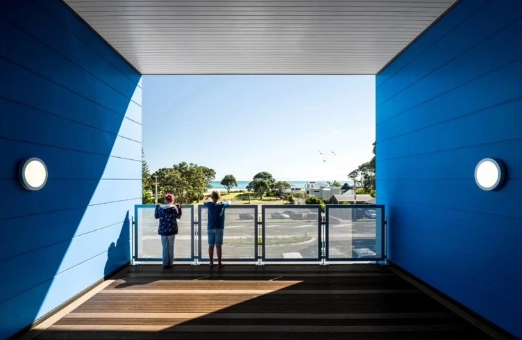
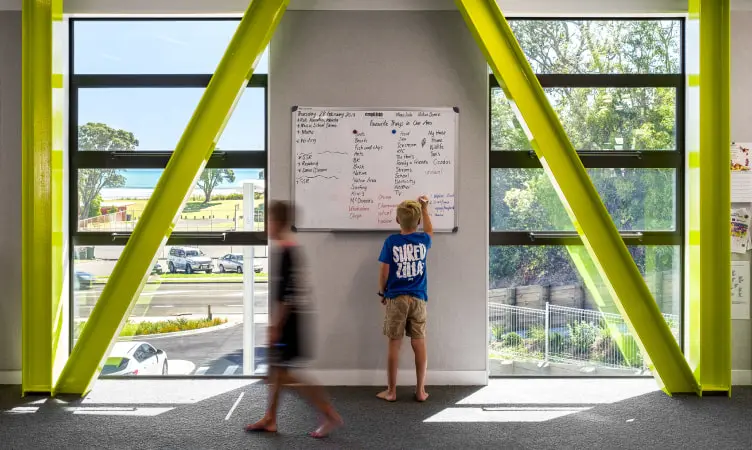
A pop of colour has been added to a variety of surfaces throughout the school. To create a playful feel upon entering, poles, bay windows, frames and aluminium joinery all share the bright blue, red, yellow and green powder coat colours. Each colour has significant meaning and is taken from the primary colours found in the school’s logo. Blue represents the school’s proximity to the ocean, red and green represent New Zealand’s native pohutukawa tree and yellow represents the sand found on Ōhope’s coastline. With the addition of brightly coloured picture windows to the neutral exterior and new landscaping, the school now sits on the forefront of the road with much-needed vibrancy. Colours are used to portray the surrounding environment and tell the stories of the land. The stories of the region are weaved into the colour palettes used on the schools exterior.
“We are proud of our involvement in creating such a unique place at the heart of Ōhope community, situated in beautiful natural environment overlooking the sea”
Jennis Lee at Ignite Architects
Project Outcomes
Dulux Colour Awards 2020 Finalist for Commercial and Multi-Residential Exterior
Products Specified
Dulux
Exterior
Dulux 1 Step Primer Sealer Undercoat (water based)
Dulux Weathershield Semi-Gloss Custom colour
Dulux Super Enamel
Dulux Acratex
Exterior
Acratex Acraprime 501
Acratex Elastomeric 201 Custom colour
Powder Coatings
Duratec® Intensity Sunshine Gloss 9002084G
Duratec® Intensity Leaf 9006167S
Duratec® Intensity Flame 9004007G
Duratec® Matt Metro Electric Cow Kinetic 9008153K
Duratec® Warm White Pearl K
Dulux
Interior
Dulux 1Step Primer Sealer Undercoat (water based)
Dulux 1Step (Oil Based)
Dulux Professional Ceiling Flat
Dulux Wash&Wear PLUS Kitchen&Bathroom Ceiling Custom Colour
Dulux Wash&Wear Low Sheen - Custom colour
Dulux Wash&Wear PLUS Kitchen&Bathroom Low Sheen Custom Colour
Dulux Wash&Wear PLUS Super Tough Low Sheen Custom Colour
Dulux Aquanamel Semi-Gloss Custom colour
Dulux Super Enamel Semi-Gloss Custom colour
Dulux Protective Coatings
Interior
Luxepoxy 4 Primer
Enviropoxy Water Borne Acrylic Epoxy Finish Custom Colour
Disclaimer
Image Credits: Dennis Radermacher