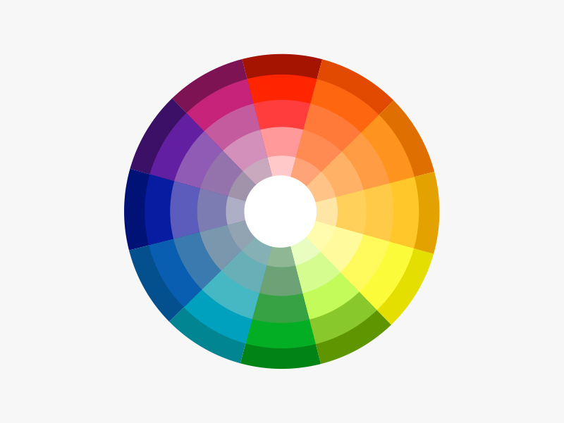
How to use a colour wheel
A colour wheel shows you how colours relate to each other and visually demonstrates the relationship between primary, secondary and tertiary colours. You can use the colour wheel to develop colour schemes with these several key approaches.
Follow the tips below to understand colour wheels
Colour wheel tips
Monochromatic
This is a variation of a single colour. Monochromatic schemes are serene and relaxing. Light tones create a relaxed delicate feel, whereas dark tones can feel moody and dramatic. Mixing light and dark tones adds interest and a touch of energy.
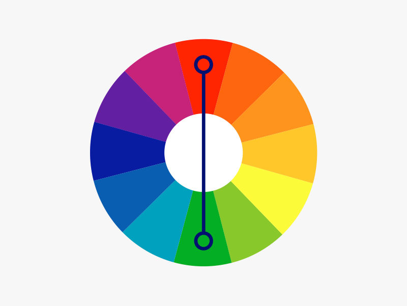
Complementary
These colours can be found on the opposite sides of the colour wheel, such as blue and orange, red and green or purple and yellow. Used together, the colours appear brighter.
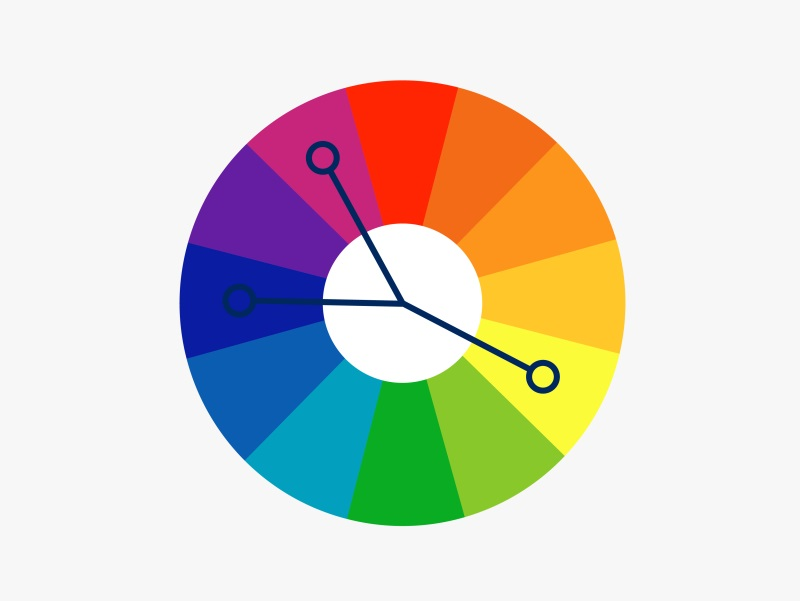
Split Complementary
The split complementary colour scheme is a variation of the complementary colour scheme. In addition to the base colour, it uses two colours adjacent to its complement. This colour scheme features less contrast, making it for the less confident.
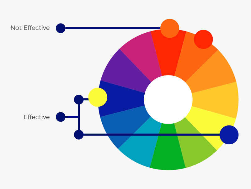

Triadic
This approach uses three different colours on the colour wheel. They can be monochromatic, complimentary or contrasting. The results are harmonious but are a little more vibrant.
Colour wheel tip
Keep undertones the same. Varying undertones can sometimes be more visible in certain environments, so don't use too many undertones if you're not confident with colour.
Book now to have an online or in-home colour consultation with a qualified interior designer.
Ask an expert. Use LiveChat to speak to one of our consultants for help about colour, products, projects and more.
Our local Customer Service team is available to assist with colour, product and service questions. The Call Centre is open 6 days a week on 0800 800 424 and LiveChat is available 7 days a week.